
Ten Shaker Kitchen Colour Combinations We’re Loving Right Now
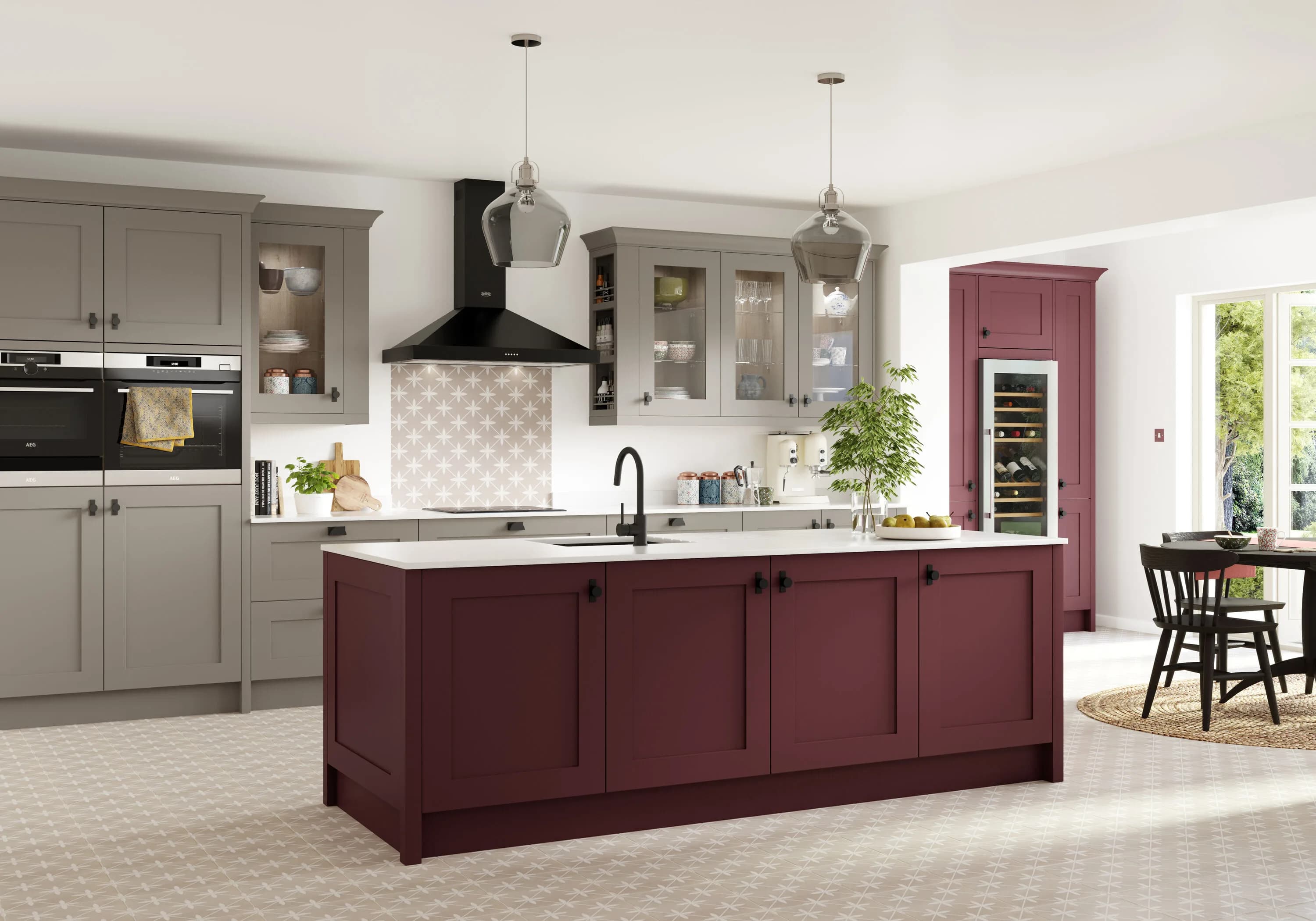
The Shaker door is famously described as the perfect canvas, and colour is where that canvas comes to life. Because the door itself is so clean and unadorned, the colour you choose does more to define the personality of the unfinished kitchen than almost any other decision. Colour combinations are where we spend some of the most rewarding conversations with our clients.
Right now, we’re seeing bolder, more confident colour choices than at any point in recent years. The colours having a genuine moment are deep greens, moody navies, warm burgundies and grounded neutrals. Meanwhile, two-tone kitchens have shifted from a bold statement into something close to a new mainstream.
We have put together ten colour combinations we’re currently loving, why they work, and where each one really shines.
1. Cream and Burgundy
The one that starts the conversation is cream cabinets paired with burgundy accents, giving you a kitchen that reads as bold, elegant and genuinely timeless all at once.
Burgundy has quietly returned as one of the most exciting colours in kitchen design after decades of quiet dominance by grey. The colour works particularly well with brass or aged brass hardware, timber or natural stone worktops, and warm-toned flooring.
It shines in substantial family homes, period properties with the ceiling height to carry the burgundy, and any kitchen where you want a defined focal point without going fully dark.
2. Sage Green and Warm Cream
The enduring country Shaker pairing, and one that continues to prove why it’s endured. Sage green sits comfortably alongside every natural material. It gives you that traditional English country feel, and when paired with a warm cream, the whole kitchen feels welcoming and lived-in without ever tripping into twee.
It shines in farmhouses, village cottages, extension kitchens in older homes, and any household that wants the kitchen to feel restful rather than architectural.
3. Deep Navy and Crisp Off-White
The modern classic is a navy that has moved from a bold choice to a genuine mainstream option. We pair it with a crisp white as a popular combination.
Navy works so well with a Shaker kitchen because the clean lines of the door stop the depth of colour from feeling heavy. Additionally, navy pairs beautifully with almost every worktop material: white quartz for a sharp contemporary reading, warm timber for softness, veined marble for grandeur, brass or brushed nickel hardware for character.
It shines in contemporary family kitchens, open-plan spaces where the island can carry the darker colour, and new-builds that need a bit of instant character.
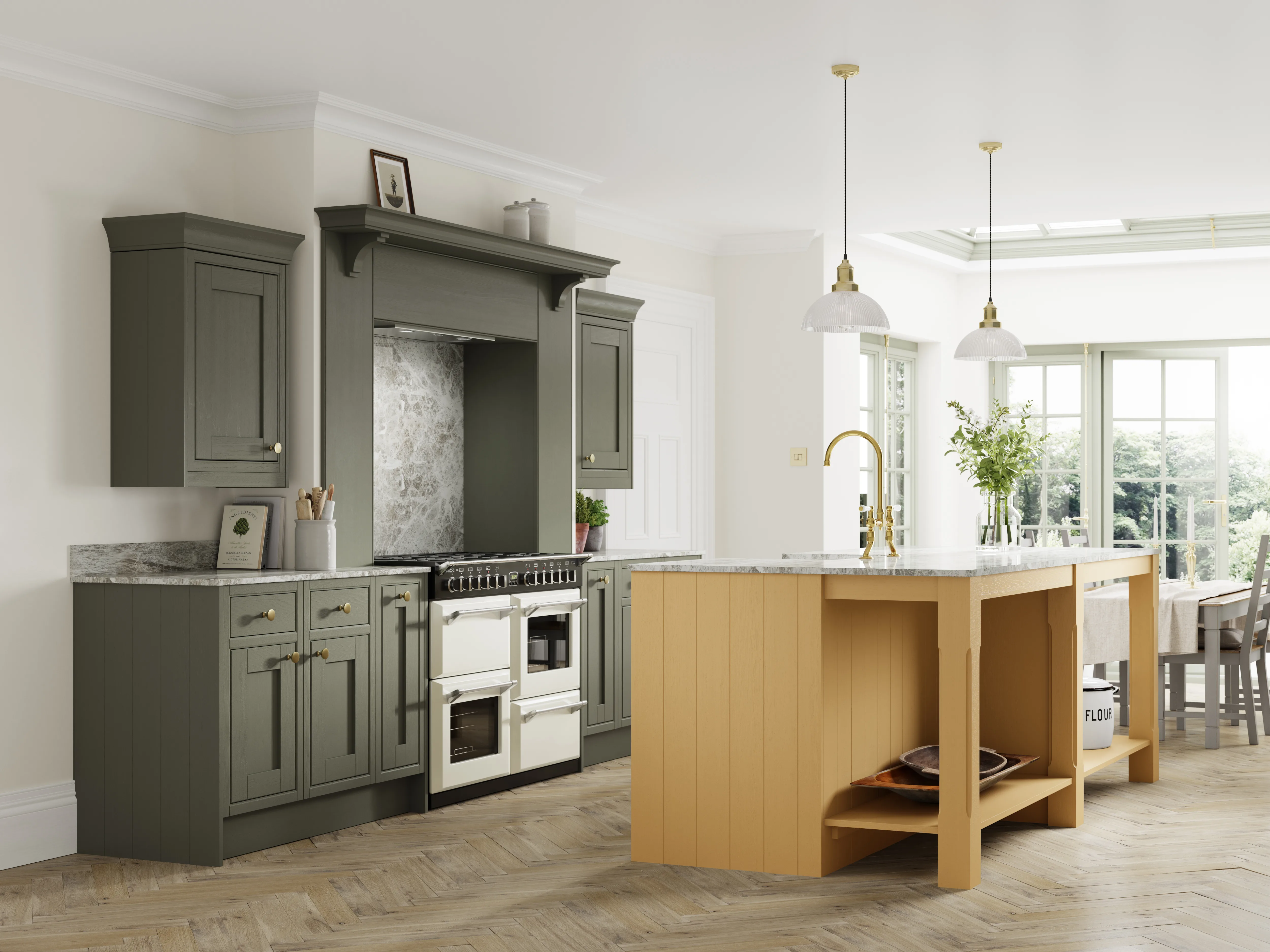
4. Forest Green and Aged Brass
Forest green is confident, and when paired with aged brass, it is one of the most striking combinations in current kitchen design.
It works particularly beautifully in kitchens with plenty of natural light, where the depth of colour has room to breathe. Meanwhile, aged brass rather than polished brass keeps the whole thing feeling considered rather than showy. Add a marbled worktop, a butler sink and pendant lighting, and you’ve got a kitchen that will still look sharp in fifteen years
It shines in period properties, garden-facing kitchens with strong natural light, and households who want depth without darkness.
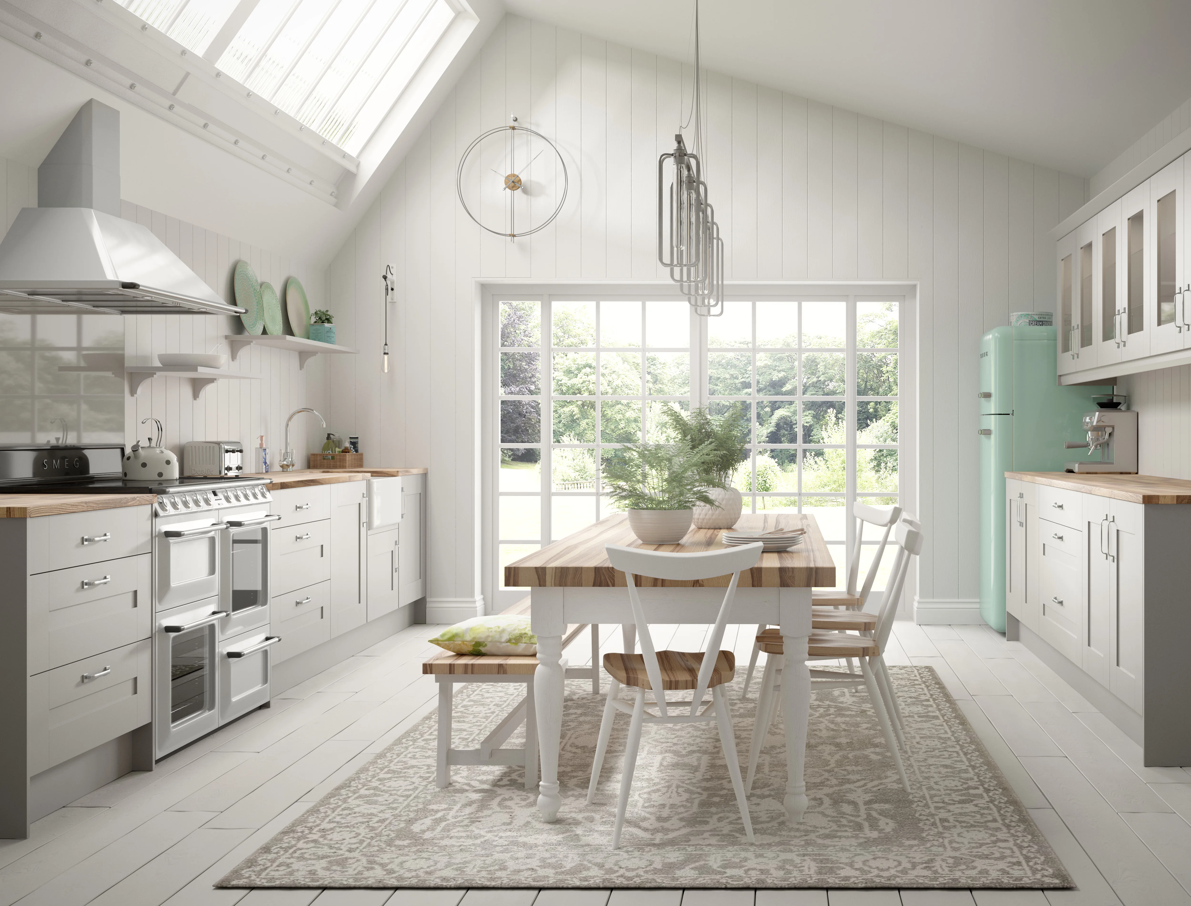
5. Warm White and Natural Oak
This is the Scandinavian-influenced Shaker where soft warm white cabinets pair with natural oak worktops and flooring, giving you a kitchen that feels bright, calm and deeply grounded.
Cold clinical whites make a Shaker kitchen feel institutional; warm whites let the natural warmth of the timber do the work. Furthermore, keeping hardware minimal reinforces the Scandi-style without losing the Shaker character.
It shines in bright kitchens with strong natural light, contemporary extensions, and households who want simplicity without severity.
6. Charcoal Base with Cream Uppers
The two-tone combination of a charcoal base with cream wall cabinets gives you all the drama of a dark kitchen without any of the heaviness.
The reason this pairing works is straightforward: dark base cabinets ground the room, while lighter uppers keep the eye level airy. Consequently, the kitchen reads as substantial without feeling closed in. Add sintered stone or veined marble worktops, matte black or brushed brass hardware, and considered lighting, and the whole thing becomes properly memorable.
It shines in kitchens with lower ceilings that couldn’t carry a fully dark scheme, contemporary open-plan spaces, and any household wanting drama with balance.
7. Heritage Blue and Buttermilk
The classic English country Shaker has been updated. Heritage blue paired with buttermilk uppers or trim gives you a kitchen that feels immediately familiar and quietly special at the same time.
This is the combination that we return to most often for period properties, particularly those with existing character. It has become a flexible choice for many home styles.
It shines in village houses, farmhouses, extension kitchens in older homes, and anyone who wants an English country feel without the twee overtones.
8. Mushroom and Ivory
The sophisticated neutral pairing that isn’t quite grey and isn’t quite beige. Mushroom is a warm, softly grounded taupe and when paired with an ivory or soft cream creates a kitchen that feels calm, considered and luxurious.
Mushroom does the practical work of a neutral while significantly more interesting than grey ever did. It pairs beautifully with warm-toned worktops in a way that grey often fought against.
It shines in households that want a neutral kitchen that doesn’t feel like a neutral kitchen, contemporary properties, and any space where warmth matters more than statement.
9. Matte Black Island with Cream Perimeter
The dramatic focal-point kitchen where the island becomes the visual anchor. The choice of matte black over gloss black matters enormously. Matte black reads as architectural and modern; gloss black reads as dated. Furthermore, the contrast between the softer cream perimeter and the confident black island keeps the whole room feeling balanced rather than overwhelming. Add brass hardware to warm the black.
It shines in open-plan kitchens where the island functions as the social heart of the room, larger family kitchens, and any household who wans a defined focal point.
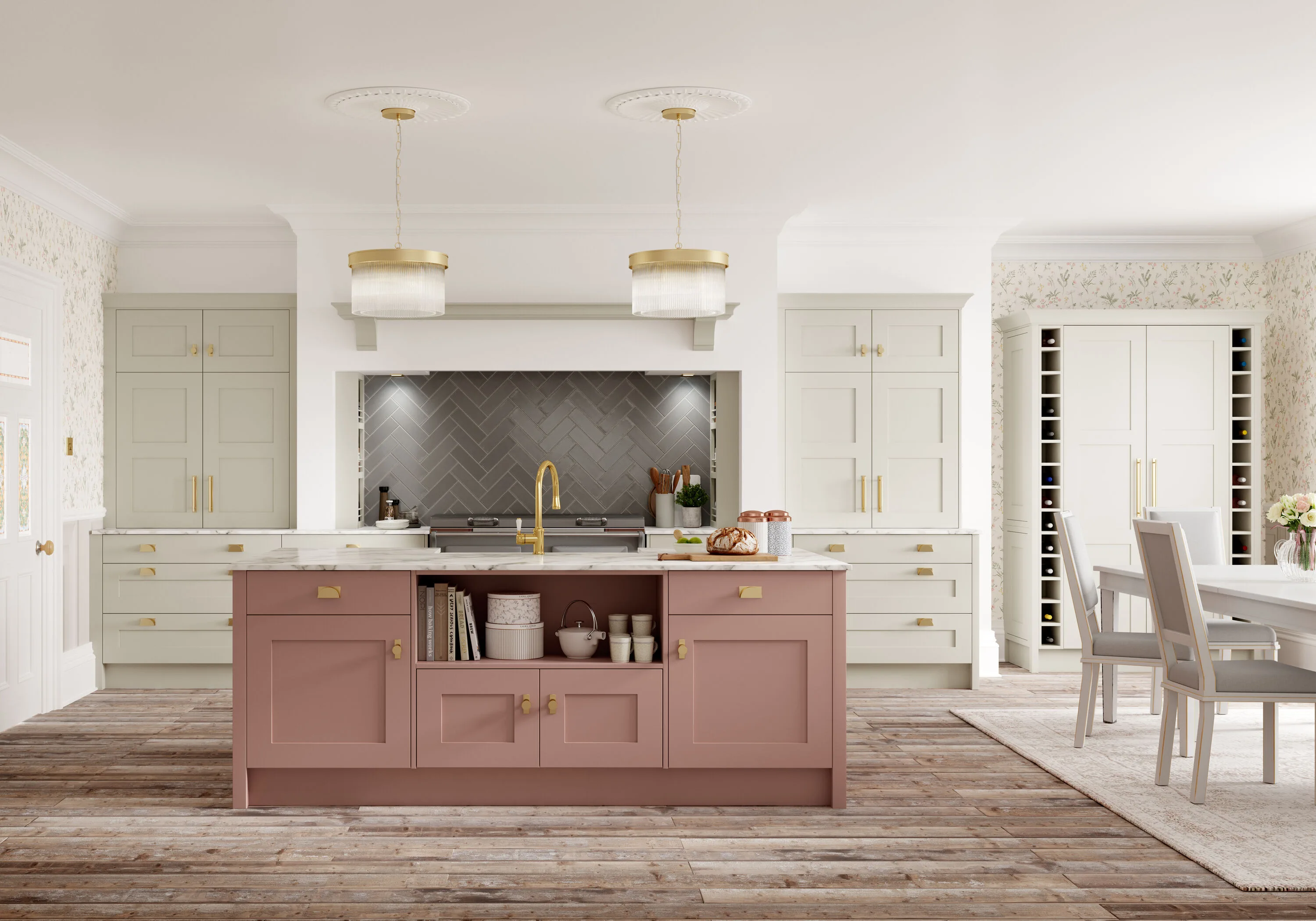
10. Dusky Pink and Sage Green
The unexpected combination that keeps quietly winning. A very soft dusky pink paired with a muted sage green sounds like it shouldn’t work, but it does.
The trick is that both colours are quiet, muted and slightly greyed. This pairing works particularly beautifully in period properties, where the softness of both colours complements existing character features without competing with them. Pair with aged brass hardware, natural stone worktops and warm timber flooring, and the whole kitchen takes on romantic quality.
It shines in period cottages, townhouses with original features, and households who want their kitchen to feel genuinely distinctive without going bold.
Choosing Between Them
If you’re drawn to more than one of these combinations, a few questions can help narrow it down.
· How much natural light does the room get?
· How long do you plan to stay in the property?
· Does the kitchen open to other spaces?
· What are your existing materials?
Frequently Asked Questions
What are the most popular Shaker kitchen colours right now?
Colour choices are bolder and more confident than at any point in recent years. Deep greens, moody navies, warm burgundies and grounded neutrals are all having a genuine moment, with two-tone schemes increasingly common in place of a single colour throughout.
What colour works best in a kitchen with low ceilings?
A charcoal base with cream wall cabinets. Dark base cabinets ground the room while lighter uppers keep eye level airy, so the kitchen reads as substantial without feeling closed in. It gives you the drama of a dark kitchen in a room that could not carry a fully dark scheme.
Is navy still a good choice for a kitchen?
Yes. Navy has moved from a bold choice to a genuine mainstream option, and it suits Shaker particularly well because the clean lines of the door stop the depth of colour feeling heavy. It also pairs with almost every worktop material, which makes it one of the most forgiving dark colours to specify.
Which colours suit a period property?
Heritage blue with buttermilk is the combination we return to most often for period homes with existing character. Forest green with aged brass works beautifully where there is strong natural light, and a soft dusky pink with muted sage suits period cottages and townhouses with original features.
Should I choose a warm white or a bright white?
Warm white, in most cases. Cold, clinical whites can make a Shaker kitchen feel institutional, whereas a soft warm white lets the natural warmth of timber worktops and flooring do the work. Keeping the hardware minimal reinforces the effect.
Does a matte or gloss finish matter on a dark kitchen?
It matters enormously. Matte black reads as architectural and modern, while gloss black reads dated. If you are using a dark colour as a focal point, such as a black island against a cream perimeter, the matte finish is what keeps it feeling current.
How do I choose between colour combinations?
Four questions narrow it down quickly: how much natural light the room gets, how long you plan to stay in the property, whether the kitchen opens onto other spaces, and what existing materials it has to sit alongside. Colour samples on a screen never tell the full story. You can see our live Shaker displays at our showroom in Langford, Bedfordshire. We design and install kitchens for homes across Bedfordshire, Hertfordshire, Buckinghamshire and Cambridgeshire.
Related Blogs
What Is a Shaker Kitchen? A Complete Guide with Bentley Kitchens
Country Shaker vs Contemporary Shaker: Two Ends of the Same Spectrum
How to Design a Shaker Kitchen: Room to Reality in Seven Steps
Visit Our Showroom
Colour samples on a website never quite tell the story. We would always encourage our clients to visit our showroom to see our live Shaker displays in person and see the different paint finishes. We look forward to welcoming you.